The Best Colours to Wear for a LinkedIn Headshot (It Depends on You)
If you search for the best colours to wear for a LinkedIn headshot, you will find the same list repeated across dozens of articles: navy blue, grey, white, black, muted tones. It is not wrong advice — those colours do photograph well. But it misses the more important question, which is not what photographs well in general, but what works for you specifically.
I have photographed Calgary professionals across every industry, personality type, and personal style, and the headshots that perform best — the ones that generate connection requests, recruiter messages, and genuine recognition — are not the ones that follow a universal colour rule. They are the ones where the subject looks like themselves. That is the actual goal of a great LinkedIn headshot, and colour is one of the most personal tools you have to get there.
Your Wardrobe Should Match Your Brand, Not a Template
Before you think about specific colours, think about the impression you want your LinkedIn profile to make. A corporate lawyer and a creative director are both Calgary professionals who need a strong headshot — but they are not trying to communicate the same thing. One might reach for a crisp white shirt under a tailored blazer. The other might show up in a rich jewel-toned top that signals confidence and individuality. Both choices can be exactly right. Neither is wrong.
The question to ask is: does this colour reflect how I show up in my work? If you are known for being approachable, warm, and personable, a soft warm tone might carry that better than a stark, cool neutral. If you project authority and precision, a strong monochromatic look might say exactly what you need it to say. Your wardrobe choice is a communication decision before it is an aesthetic one, and the best sessions start with that conversation.
Why Neutrals Work — And When They Do Not
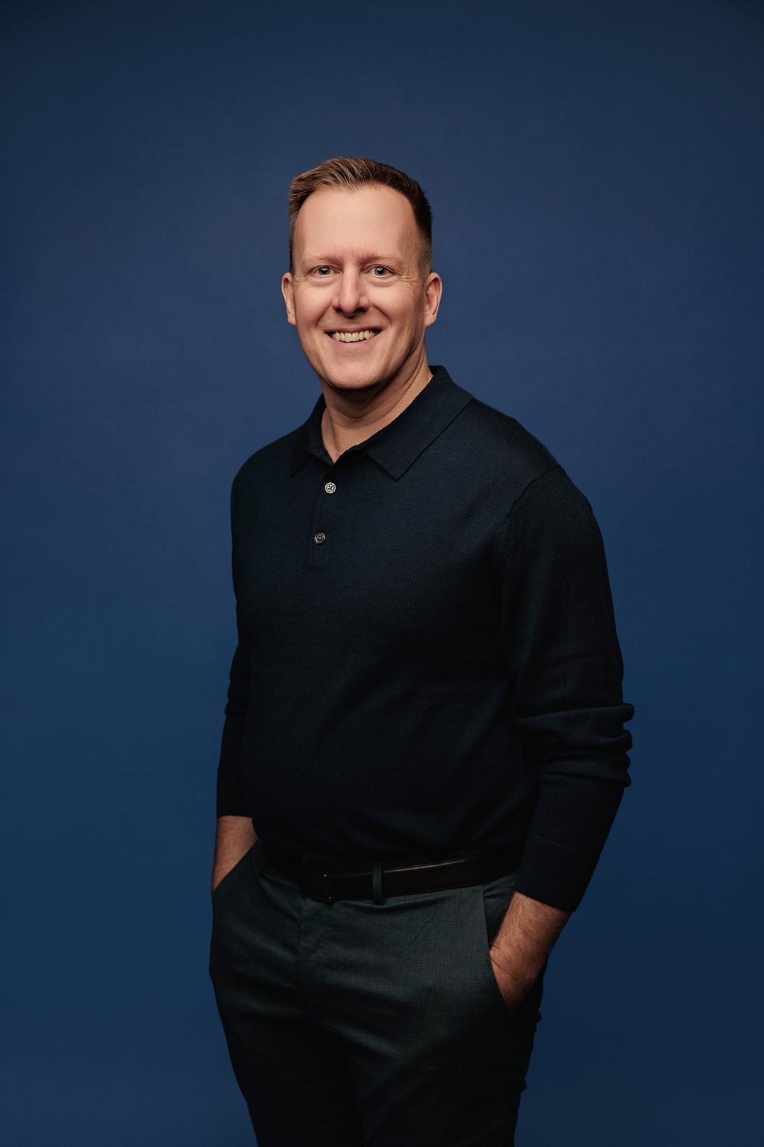
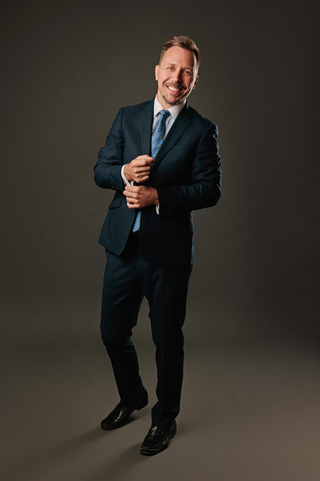
Neutral colours — navy, charcoal, camel, cream, soft grey — are consistently recommended for headshots because they rarely compete with the subject's face. They do not pull attention toward the clothing, which is generally where you want it. They also tend to age well, meaning a headshot taken in a timeless neutral will not look dated in two years the way a trend-driven outfit sometimes can. For professionals in more conservative industries — finance, law, engineering, corporate consulting — a neutral wardrobe is often the most appropriate signal.
That said, neutrals can also flatten. If your entire brand presence is built on personality, warmth, and energy, arriving in grey on grey might produce a technically fine photograph that feels nothing like you. A headshot that is technically polished but emotionally inert is not doing its job. The goal is not just a clean image; it is an image that makes the right person want to reach out. Sometimes a neutral is the best tool for that. Sometimes it is not.
When Colour Is Exactly the Right Call
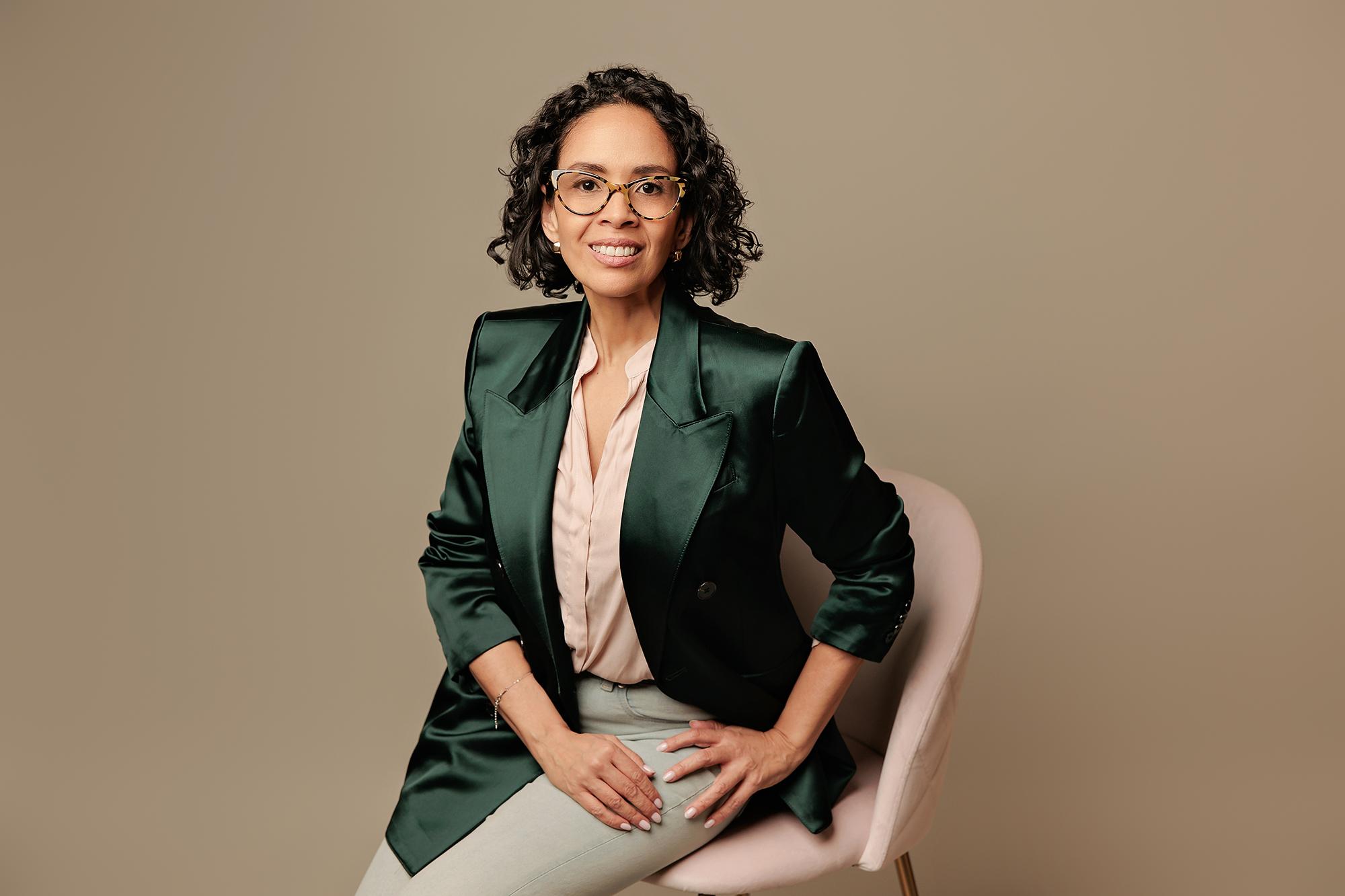
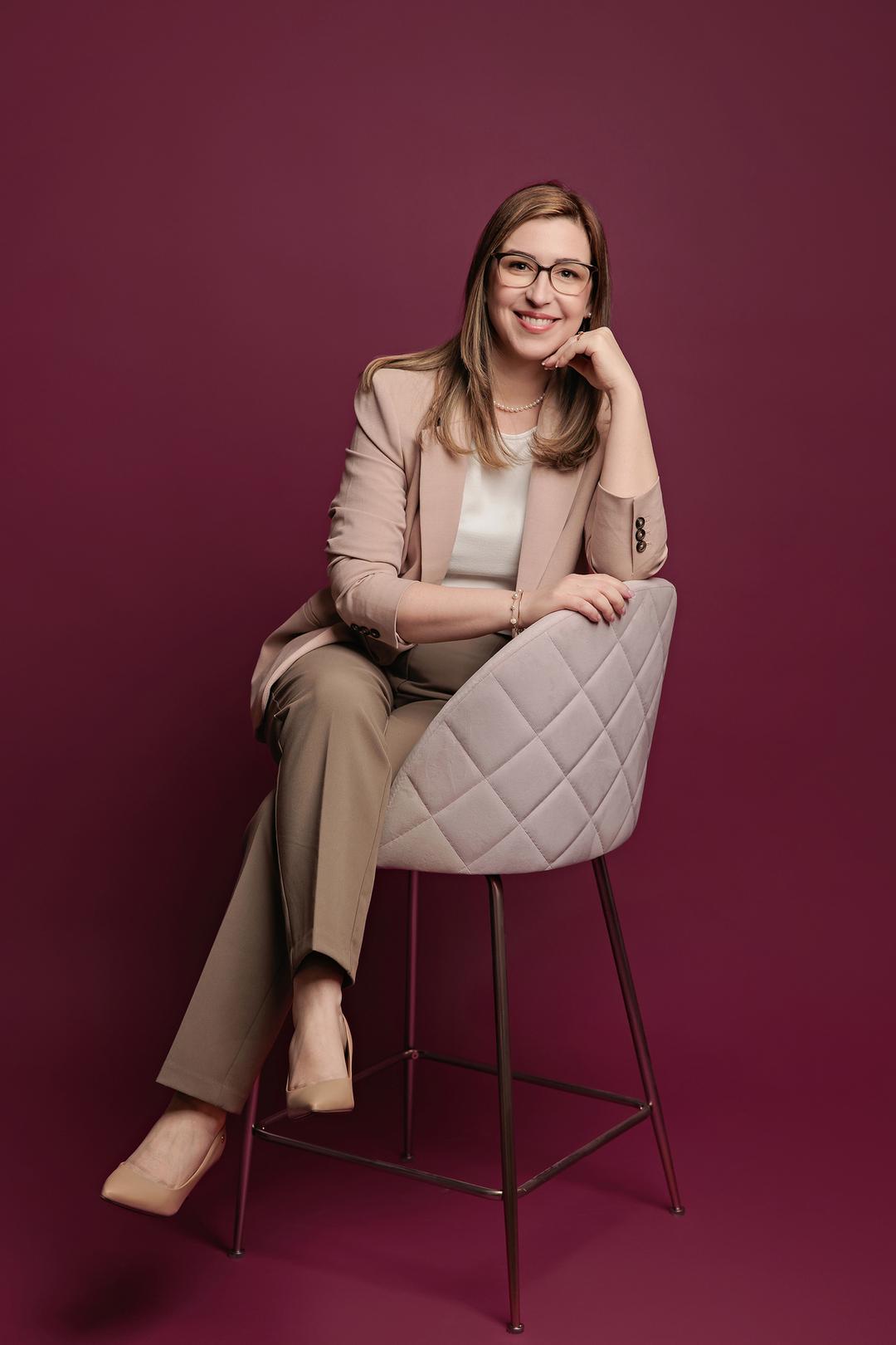
Colour in a headshot is not a risk, it is a tool. A well-chosen colour can make a photograph memorable, convey energy and confidence, and immediately differentiate a profile from the sea of navy and grey on LinkedIn. The clients I photograph who come in with a considered colour choice — a deep burgundy, a warm terracotta, a confident cobalt — often end up with their most compelling images, because those choices are an extension of how they actually present themselves in their work and their life.
The practical considerations are straightforward: avoid colours that are very close to your skin tone, as they can create a washed-out effect. Steer clear of busy patterns or logos that compete with your face. Beyond that, the range of what works is genuinely wide. If you wear colour every day and it is part of how people recognise you, bringing that into your headshot is not a bold decision — it is an honest one. Browse the portfolio and you will see the full range: neutrals, colours, warm backdrops, cool backdrops, and strong, effective results across all of them.
The Backdrop Is Part of the Colour Story Too
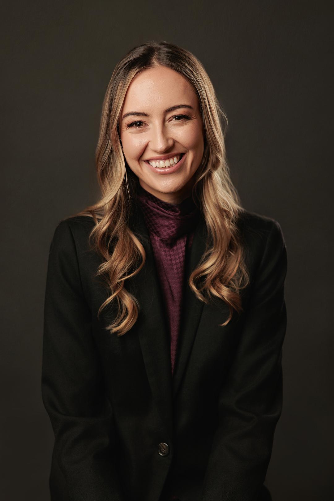
Most people spend all their wardrobe energy on clothing and forget that the backdrop is doing just as much colour work in the final image. A warm-toned backdrop will interact differently with a cream blouse than with a cobalt blue jacket. A cool, deep grey backdrop will change how a bright colour reads versus how a neutral reads. The relationship between clothing colour and backdrop colour is what creates the overall tone and mood of a photograph, and it is something we think about carefully at every session.
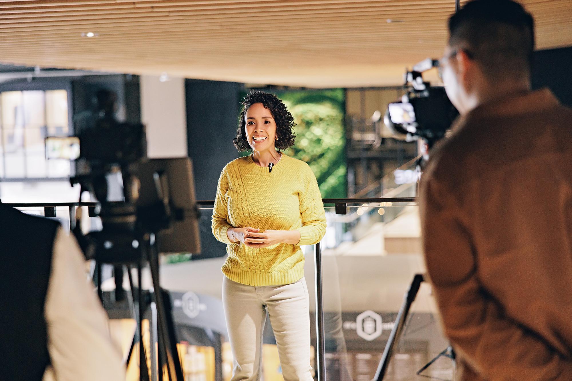
This is part of why trying to plan your exact colour combination without seeing the available backdrops is difficult. At our Calgary studio, we work through these decisions with you on the day — adjusting backdrop choices based on what you have brought, what your goals are, and what is reading well in the frame. It is a collaborative process, and it takes the guesswork out of a decision that feels high-stakes but does not have to be.
Not sure what to wear to your headshot session? You do not have to figure it out alone. At Amanda Dams Headshots, every session includes a pre-shoot consultation where we talk through wardrobe, backdrop, and the impression you want your professional headshots to make — so you show up confident and leave with images that genuinely represent you.
Book a Complimentary ConsultationBring Options and Let the Session Decide
The most practical advice I can give on wardrobe colour is this: bring more than one option. Most clients arrive with two or three outfits, and that flexibility consistently produces better results than arriving committed to a single look. Different colours interact with your skin tone, the lighting, and the backdrop in ways that are hard to predict without a camera in the room. Having options means we can make real decisions based on what is actually working, not what seemed right at home.
A good starting point is to bring one neutral option and one colour option — whatever colour you actually wear and feel good in. From there, let the session guide you. A personal branding session is designed to give you variety, which means multiple looks across different wardrobe and backdrop combinations. That variety is what gives you a library of images to use across LinkedIn, your website, your speaking bio, and social media — each one consistent in quality, each one showing a slightly different dimension of who you are professionally.
The Colour That Works Best Is the One That Feels Like You
At the end of the session, the images that clients respond to most strongly are almost never the ones they were most uncertain about — they are the ones where something clicked. The colour felt right, the backdrop complemented it, the lighting landed well, and the expression in the frame matched how they actually feel about their work. That combination is what makes a headshot effective, and no universal colour recommendation can manufacture it.
What I can tell you with confidence, after photographing Calgary professionals week after week, is that the clients who walk in knowing who they are — and who bring clothing that reflects that — consistently leave with stronger images than those who arrived dressed for a version of themselves they thought they were supposed to present. Wear what you would wear to a meeting with a client you genuinely want to impress. If that is navy, great. If it is terracotta, great. The goal is a photograph that looks like the best, most authentic version of the professional you already are. If you are ready to get that image, book your session at our Calgary studio and we will handle the rest.
There is no single right answer to what colour to wear, but there is a right answer for you. Book your Calgary headshot session at Amanda Dams Headshots and arrive knowing that whatever you bring, we will make it work beautifully.
Book Your Session
Amanda Dams
With 16 years behind the camera, I have dedicated my studio to one thing: creating images that make people say “that actually looks like me, but better.”
Learn more